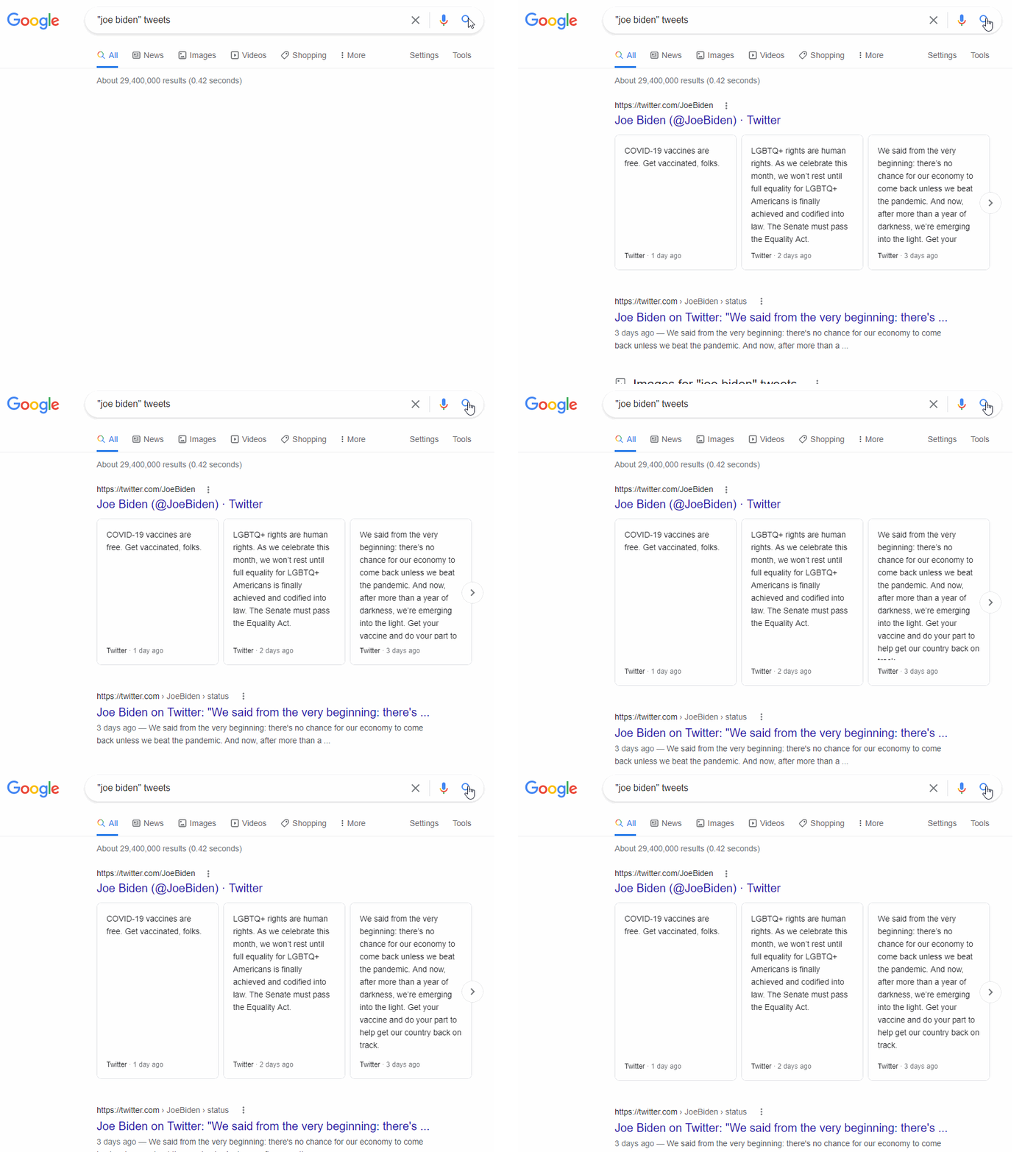
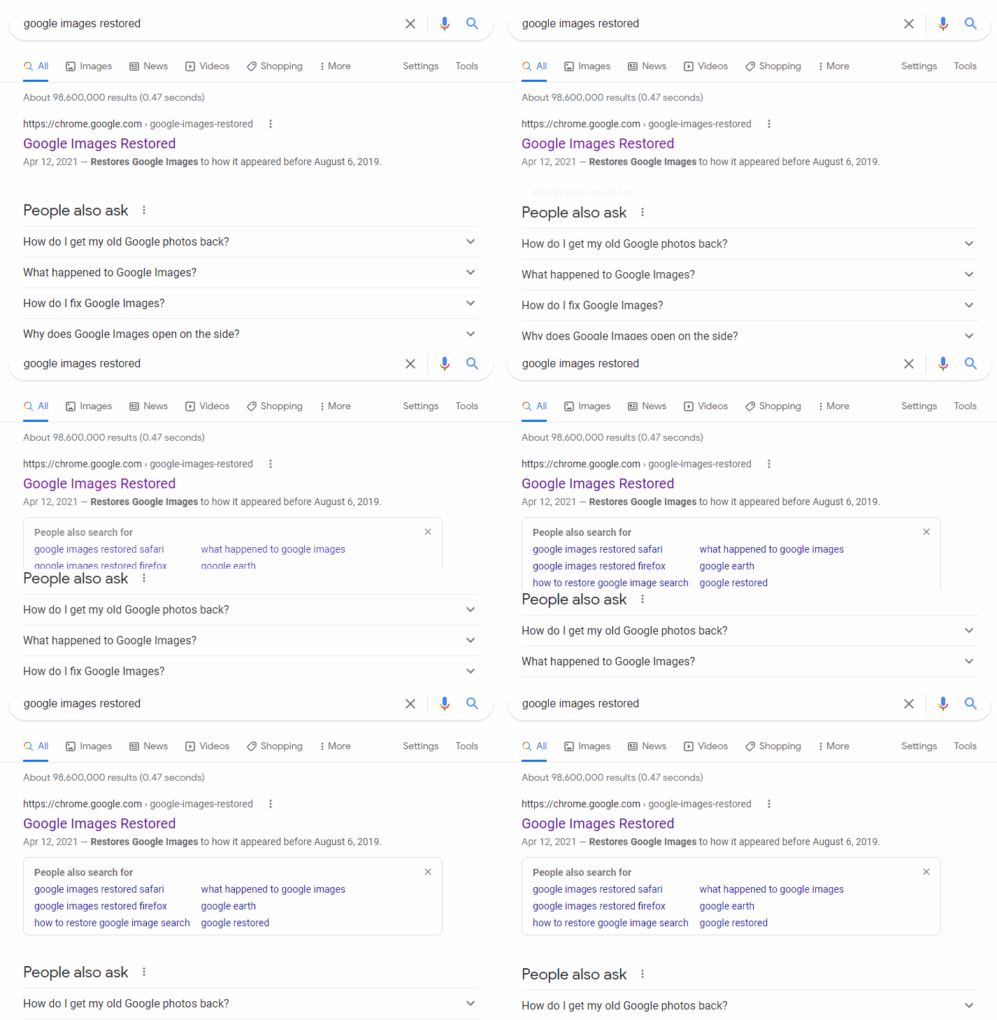
i don't remember when this started (at least 2018), but this is the most irritating thing:

you search for something, and then the page moves down a little bit to make room for some element at the top of the page that suddenly expanded by a centimeter. typically, i will have found the result of my search I want right away, go to click it, and then i either 1) accidentally click on empty space or 2) accidentally click on the wrong link, because the content I meant to click on shifted down a little bit for NO reason.

this is particularly egregious with the "People also search for" box that suddenly appears randomly, and without warning. until I found a way to hide this box from showing up randomly, I was clicking on the wrong links all the time. here's a stackexchange link that shows how to stop the "People also search for" popup.
my question is - what is the point of it? I get they probably want to call attention to some "thing" for you see and click on. like a hand waving Hey Look Over Here gesture. everyone always likes to rag on the <blink> tag from back in the day, but at *least* that didn't cause UI usability issues. imo this is even more distracting!