 ) happening by pure chance. Realizing this sort of texture was the result of pure css (no images, javascript, canvas, etc) I wanted to home in on what exactly was producing this texture.
A few years ago I made a gradient generator that stacked layers of gradients on top of each other and animated them based on whatever text input you fed it. It was deterministic--the user input was hashed and always created the exact same gradient animation.
After hundreds of iterations, I started to notice some sections which had some dither pattern texture, (  ) happening by pure chance. Realizing this sort of texture was the result of pure css (no images, javascript, canvas, etc) I wanted to home in on what exactly was producing this texture.
I removed one layer at a time that didn't rid of the texture until I was left with 2 layers: a grey-ish gradient top layer with blend-mode set to hue, and an underlying layer of a solid color. Re-creating this in the form of 2 divs results in the following:
| ff | chromium |
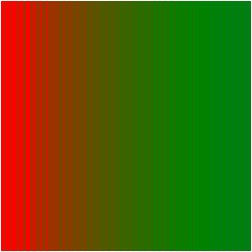 | 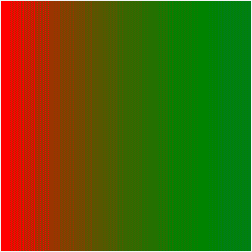 |
firefox's blend-mode renderer seemed to be a little bit more on-par with photoshop's (solid lines rather than dithered ones, as chrome's did).. so I continued investigating with overlaying layers in photoshop from this point forward. I noticed that the solid lines could be instantly more dither/moire-like by rotating the gradient ever so subtly, and then adjusting the scale (zoom) of the gradient.. e.g.
| 180deg | 179deg | 178deg | 170deg |
 | 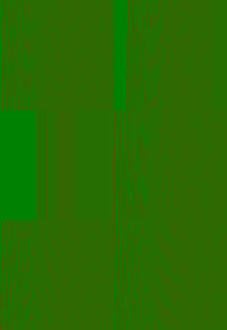 | 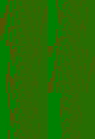 |  |
after lots of trial and error and some tweaking of parameters, I found a set of parameters that (only in chrome) is pretty much what I was looking for:  (jsfiddle)
I posted the set of parameters to the stackoverflow thread as a proof of concept.